Chapter 3 Sampling
The following packages are required for this chapter.
library(tidyverse)
library(infer)
# Infer package is only needed in this chapter for the rep_slice_sample() function.
3.1 Sampling Terminology
In everyday language, people use the word “statistics” in two very different ways. When someone talks about basketball statistics, like what percentage of shots are made, they are referring to descriptive statistics. Descriptive statistics are simply mathematical calculations on known data: mean, median, percentage, max/min, etc. When someone talks about a statistician, they are usually referring to a professional that does statistics for a living. It obviously doesn’t require a professional statistician to compute descriptive statistics from sports data.
Such professionals are trained in inferential statistics, a branch of mathematics that seeks to infer (make educated guesses based upon probability) about unknown populations of people, animals, things, or perhaps the unknown effects that a new medicine might have on a populations of people or animals. The scenario is as follows: A population parameter (mean, proportion, etc) is unknown. But you simply can’t measure the whole population because it’s too large, too difficult, or too costly to measure. Some populations are so large (e.g. number of cells in the human body) that they might as well be infinite in terms of trying to measure it all. When possible, measuring some aspect of an entire population is called a census.
When a census can’t be conducted, a sample (hopefully, random/unbiased) is taken from the population. The goal is to use that sample and the mathematics of inferential statistics to infer about some aspect of the unknown population. Samples are typically much, much smaller than the entire population, so statistical inference doesn’t enable you to conclude something about the unknown population with absolute certainty, but rather only up to a desired level of probability (called confidence).
To reliably infer about an unknown population, the sample taken from it must be reasonably representative of the population as a whole. For example, you can’t reliably infer about the average height of people in general by measuring the heights of a sample of people at a basketball or volleyball tournament. Such a sample is likely to contain more tall people than would a sample taken from the general population using proper sampling methodology. Common sampling techniques that facilitate robust inference include: simple random sampling, systematic sampling, stratified sampling and cluster sampling. Details of such techniques are commonly included in introductory statistics courses and are easily referenced online. This book provides sample data sets that are presumed to have been collected using valid random sampling methodology, so we won’t say any more about the issue. But you would need to be mindful to use a proper random sampling technique should you need to collect your own sample date at some point.
The Key Question:
What’s the probability that a random sample accurately represents the population from which it is taken? That is perhaps the most central concern in Inferential Statistics. The Central Limit Theorem, discussed later in this chapter, provides the answer to that question. Before getting into such details, we’ll begin by drawing some random samples from known populations to see how accurately those samples actually represent the populations from which they were taken. Exploring the nuances of that will be of great benefit when applied to actual inference about unknown populations!
The next few sections use the methodology outlined below to demonstrate the theory behind random sampling. With that understanding, you’ll be in a better place to understand the Central Limit Theorem.
- Start with a known probability distribution assumed to model a population, or perhaps a data set containing some measurement (height, weight, etc.) taken from an entire population.
- Use one of R’s randomization functions to draw a random sample(s) from the population.
- Compare the sample to the population to see how well the sample actually represents the population.
3.2 Random Sampling
We’ll begin by using the rnorm() probability function to obtain the following n=25 random sample from the Standard Normal Distribution. Notice that the output is a vector of the 25 numbers randomly sampled from the N(0,1) distribution.
##  [1] -0.9619 -0.2925  0.2588 -1.1521  0.1958  0.0301  0.0854  1.1166 -1.2189
## [10]  1.2674 -0.7448 -1.1312 -0.7164  0.2527  0.1520 -0.3077 -0.9530 -0.6482
## [19]  1.2243  0.1998 -0.5785 -0.9423 -0.2037 -1.6665 -0.4845
Obviously, the 25 numbers in the random sample don’t reveal much of anything to the human eye. But now consider Figure 3.1 which shows where the 25 numbers fall on the x-axis in a Standard Normal Distribution plot. Faint vertical white lines have been drawn above the sampled numbers to make it more apparent how the sample is distributed.
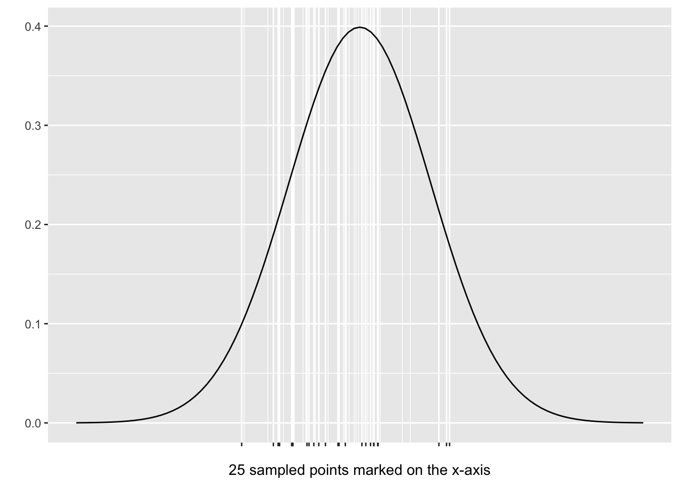
Figure 3.1: Random Sample from a N(0,1) Distribution
The N(0,1) Distribution is centered at x=0 so its quite clear in Figure 3.1 that the sample significantly over-represents negative numbers and under-represents positive numbers. Indeed, if the random sample were to perfectly represent N(0,1) data, about half of the sampled values would be negative and half positive. But in this particular sample, 15 out of the 25 values are actually negative.
Random Numbers vs Random Sample From a Distribution: Note in the above discussion that we didn’t say we were generating “random numbers.” Rather, those numbers were randomly sampled from a normal distribution, where much of the probability density is concentrated near the middle. Therefore it is much more likely that numbers near 0 (the middle) occur compared to numbers out under the tails. So randomly sampling from a normal distribution is much different in concept than simply “generating random numbers” which would tend to have a uniform distribution if they are truly random.
Copy the entire chunk of code below and execute it a few times in your RStudio Console. You will see that rnorm() generates the exact same vector of numbers each time. What the heck? Isn’t it supposed to be random? You’ve probably guessed that the reason is the set.seed(1) line at the top. If you change the seed number to 2 or 3, for example, you will see that each seed results in a different random vector, but the exact same one each time for the same seed.
set.seed(1)
random_sample <- rnorm(n = 5, mean = 0, sd = 1)
random_sample  # vector of random selections from a N(0,1) distribution
## [1] -0.626 0.184 -0.836 1.595 0.330The seed can be any positive integer up to just over 2 billion. Generally speaking, when taking random samples, you do NOT want to set a seed (meaning just don’t include set.seed()) so that you actually get a random sample. But in some cases, you want the same set of numbers each time you run your R code (like when writing stats programming chapters!) so setting seeds can be useful in some cases.
Random Number Generators and Seeding:
The
r-*functions (rnorm() for example) in R are randomly seeded which means the functions tend to generate a different vector of numbers each time. Think of a seed in this context as a pre-condition for the algorithm that generates the nubmers. Change the seed each time and the algorithm generates different numbers. Since the seed influences the algorithm, and the same seed could occur twice, even though that probablity is extremely small, randomly seeded number generators are said only to bepseudorandom.
The left side of Figure 3.2 shows the exact same n=25 random sample from Figure 3.1, but this time plotted as a histogram so that you can easily see the sample’s distribution. It’s quite appraent that negative values were over-represented in the sample.
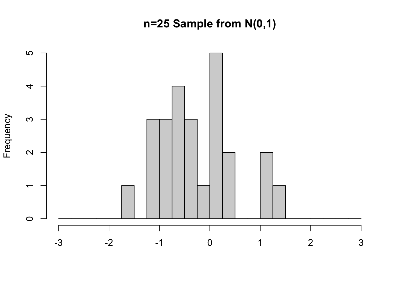
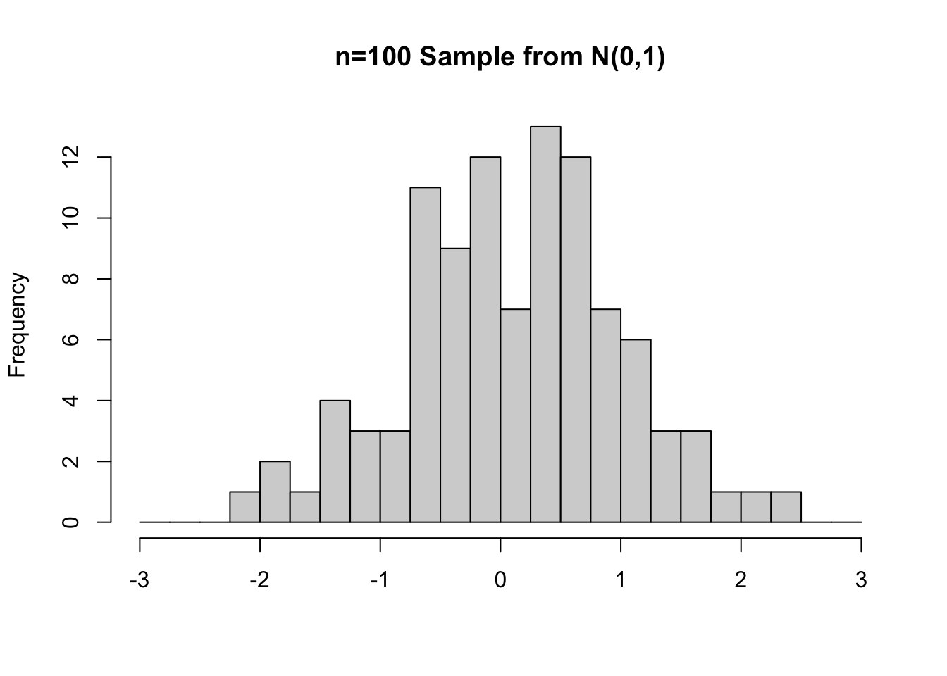
Figure 3.2: Random Samples from N(0,1) of sizes n=25 (left) and n=100 (right)
The right side of Figure 3.2 shows a different random sample from a N(0,1) distribution, but this time of size n=100. Because of the larger sample size, notice that the shape of the histogram is closer to the shape of the N(0,1) distribution from which the random sample was selected.
Sample Size:
Common sense tells us that a larger sample is more likely to “represent” the population from which it was taken than a small sample. That’s why small samples are less reliable for statistical inferrence. The histograms in Figure 3.2 demonstrate that principle rather well.
You might have noticed that the histograms in Figure 3.2 looks a bit different than histograms generated by ggplot2 and the geom_hist() function. That’s because we used the Core R hist() function for simplicity. Some example code is shown below. The breaks input is similar to bins in ggplot2 histograms and the rest should be self explanatory.
# Plotting a random sample using the Core R hist() function
random_sample <- rnorm(n = 50, mean = 0, sd = 1)
hist(random_sample, breaks = 16 , xlab = 'Sampled Values', ylab = 'Frequency')
Copy and paste the above code into the RStudio console and execute it a few times. The sample size of n=50 is not huge, so if you run the code several times, some won’t be shaped like the bell curve from which the sample was taken. But if you increase the sample size to something large, say n=1000, then the resulting histogram will quite closely resemble the shape of a bell curve.
So why did we choose to use the Core R hist() function instead of our old friend geom_hist() from ggplot2? Primarily for simplicity since the random_sample in the above code is a vector which can be directly plugged into the hist() function. It would take a bit more work with geom_hist(), which wants data formatted as columns in a table (actually tibble).
But a secondary reason we used hist() is to emphasize that Core R provided functions to generate plots long before packages like ggplot2 were built to enable creation of fancier plots. Of course, that enhanced plotting capability also increased the complexity of creating plots. It should come as no surprise to you that Core R provides built-in functions for most standard plots should you want to quickly plot something without pulling in the full power of ggplot2.
Before pushing further into using R programming and sampling theory, it’s important to define key terminology and notation. The values in a sample are usually denoted by \(x_1, x_2, ... , x_n\), where \(n\) is the size of the sample. The sample mean (average) is calculated by
\[\bar{x} = \frac{x_1 + x_2 + \cdots + x_n}{n}\]
where \(\bar{x}\) is pronounced “x bar.” The *sample standard deviation** is calculated by
\[s = \sqrt{\frac{(x_1-\bar{x})^2 + (x_2-\bar{x})^2 + \cdots + (x_n-\bar{x})^2}{n-1}}\] Each term \(x_i-\bar{x}\) measures a distance - how far a value is from the sample mean. Squaring the terms make them positive, so that values less than and greater than the mean both contribute a positive value to the sum. Adding all the terms and dividing by \(n-1\) essentially averages all the distances. Taking the square root of the entire expression “undoes” the squaring of the terms. Of course a true average of all the terms would divide by \(n\) instead of \(n-1\). Using \(n-1\) is necessary mathematically to make \(s\) an unbiased estimator of the population standard deviation. In this context, “bias” is a relatively complicated mathematical notion that’s well beyond this discussion.
The sample variance is simply \(s^2\), the square of the standard deviation. Variance is a very important quantity in the mathematics behind statistical theory. But the the standard deviation is a more easily human-understandable quantity as demonstrated by the 68-95-99 rule for normal curve areas that are within 1,2, and 3 standard deviations of the mean. Expressing that as 1, 4, and 9 variances just doesn’t roll off the tongue. The z-score value is also a standard deviation measure.
When you use a dplyr pipeline like table_name %>% summarize( mean = mean(table_column), sd = sd(table_column)) to compute descriptive statistics for table columns, the mean and sd are calculated using the above formulas for \(\bar{x}\) and \(s\). One should never lose sight of the fact that functions provided by programming languages often implement mathematical formulas or algorithms behind the scenes.
When computed from a sample for the purposes of statistical inference, each of the quantities \(\bar{x}\) and \(s\) (and \(s^2\)) is called a point estimate. Referring back to the terminology introduced above, the point estimates \(\bar{x}\) and \(s\) are descriptive statistics computed from a sample. Thus, things like \(\bar{x}\) and \(s\) computed from samples are often called sample statistics. It doesn’t take a statistician to compute sample statistics. You could have handled those calculations in high school, or earlier.
In contrast, inferential statistics involves using such point estimates (sample statistics) to infer about the corresponding unknown population parameter. Some terminology and notation is provided in the table below.
| Sample Statistic | Point Estimate From Sample | Unknown Population Parameter |
|---|---|---|
| Mean | \(\bar{x}\) (or \(\hat{\mu}\)) | \(\mu\) |
| Standard Deviation | \(s\) | \(\sigma\) |
| Proportion | \(\hat{p}\) | \(p\) |
The point estimate is simply the best guess about the population parameter based upon the sample. The table above only lists some common population parameters for which sample statistics are computed as point estimates. Basically any other stat you compute from a sample (median, etc.) can be viewed as point estimate for the corresponding unknown population parameter.
The key question is then what’s the probability that the unknown population parameter is actually close to the point estimate? As usual, it takes mathematics to shed light on the answer to that question, which is at the foundation of statistical inference.
3.3 Sampling Distributions
This section introduces the concept sampling distributions together with related terminology and concepts. Sampling distributions are the main ingredient in the Central Limit Theorem (CLT), which is a bedrock in the mathematical theory of statistics. This section very briefly introduces the concept of the CLT, and the next section provides a much more detailed coverage.
Sampling Distributions and CLT Video
Spend about 3 minutes to watch this clever video which introduces terminology and concepts pertaining to Sampling Distributions and the CLT:
https://youtu.be/jvoxEYmQHNM
Being intrigued by the above video, we (remarkably) were granted access to the Kings Landing Royal Archives to acquire dragon wingspan data going all the way back to the First Age of the Seven Kingdoms, long before the might of dragons was used to seize the throne. The dragon data, which includes the entire dragon population, was acquired at great personal risk. It is rather surprising that the data even exists. Dragon measuring has always been “officially” discouraged, not only because of the inherent danger, but also because of the obvious (to anyone but the completely oblivious) ethical implications regarding dragon privacy. The dragon data is imported from a CSV file by the code below.
dragon_population <- read_csv("http://www.cknuckles.com/statsprogramming/data/dragon_data.csv")
dragon_population
## # A tibble: 2,510 × 1
##    wingspan
##       <dbl>
##  1      5.1
##  2      4.7
##  3      5.4
##  4      5.3
##  5      5.8
##  6      5.3
##  7      4.4
##  8      4.9
##  9      5.9
## 10      5.9
## # ℹ 2,500 more rows
When you acquire data, the first order of business is to do some exploratory analysis. The code below produces a histogram showing the shape of the data, and following that the population parameters are computed.
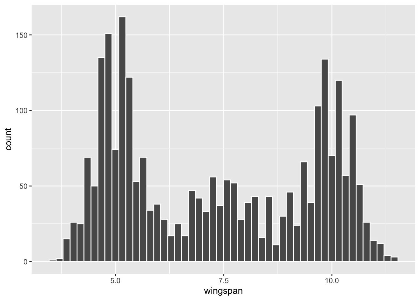
Figure 3.3: Histogram of Dragon Population
population_parameters <- dragon_population %>%
  summarize(
    population_mean = mean(wingspan),
    population_sd = sd(wingspan),
    N = n()
  )
population_parameters
## # A tibble: 1 × 3
##   population_mean population_sd     N
##             <dbl>         <dbl> <int>
## 1            7.34          2.23  2510
Note that the dragon wingspan for these \(N=2510\) dragons is definitely not normally distributed. In fact, it doesn’t appear to match any common type of distribution. The data has sort of a tri-modal shape with three main “humps.” That is, there are lots of dragons with small wingspans, lots of dragons with large wingspans, somewhat fewer with medium wingspans, with relatively few dragons having wingspans lengths between the humps. Most scientists think the two original dragon species, Horntail and Ridgeback, interbred over time which led to a lot of variability in wingspan length. (Don’t say this out loud, but some have insinuated that the wingspan variability resulted from dragon genetic engineering by the mad King’s Alchemists.)
In keeping with the purpose of this section, the next agenda is to take random samples from this population. The dplyr package provides the slice_sample() function that randomly selects rows from a table. The term slice refers to a subset of the rows of a table, much the same way that slices of bread relate to the whole loaf.
The code below randomly selects a sample of 75 rows (out of the 2510 total) from the table, stores the result in a new table named dragon_sample, and then prints the resulting table that contains the sample. In the tibble view of the sample, the rows are numbered 1,2,… but those are just the sample numbers and have nothing to do with the row numbers in original population table.
dragon_sample <- dragon_population %>%
  slice_sample(n = 75)       # random sample of size 75
dragon_sample
## # A tibble: 75 × 1
##    wingspan
##       <dbl>
##  1      5.9
##  2      5.6
##  3      4.6
##  4      6.1
##  5      5.2
##  6      5.2
##  7      3.8
##  8      6.1
##  9      9.9
## 10      8
## # ℹ 65 more rows
Using the dragon_sample generated above, the code below first generates a histogram from the sample, and then sample statistics that can be compared with the population histogram and corresponding population parameters generated further above.
ggplot(dragon_sample, mapping = aes(x = wingspan)) +
  geom_histogram(bins=50, color="white") +
  scale_x_continuous(breaks = 4:11)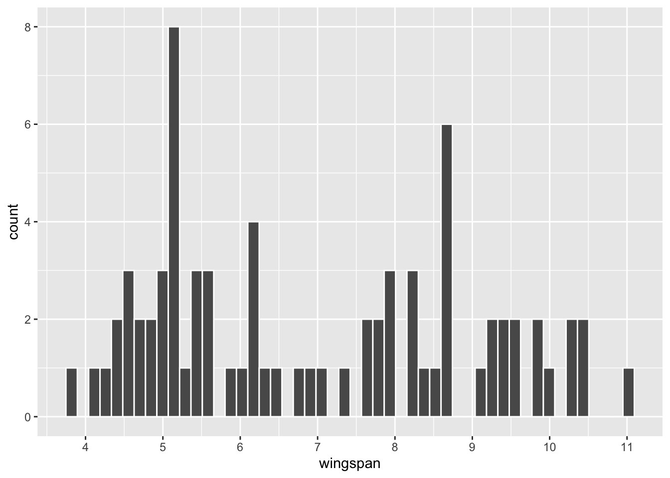
Figure 3.4: Histogram of n=75 Dragon Sample
sample_statistics <- dragon_sample %>%
  summarize(
    sample_mean = mean(wingspan),
    sample_sd =  sd(wingspan),
    n = n()
  )
sample_statistics
## # A tibble: 1 × 3
##   sample_mean sample_sd     n
##         <dbl>     <dbl> <int>
## 1        6.96      2.00    75
Upon a casual visual inspection of the histograms, this sample seems to under-represent dragons with large wingspans compared to the population. The numbers back that up. The mean of the sample is 6.96, whereas the mean of the population is 7.34. In fact, the 3 “humps” in the population histogram are not even readily apparent in the sample.
Try it!
Create an R script and execute the dragon sampling code several times. Each time, observe that the sample histogram (probably) has a somewhat different shape and sample statistics.
If you do as suggested above, you will observe the concept of sampling variation. Of course, because the samples are randomly selected independently of each other, they tend to be different each time. A good way to think of sampling variation is that some samples better represent the population than others. An “unlucky” sample might NOT be very much like the population at all. On the other hand, a “lucky” sample might represent the population quite well.
Is the dragon_sample in Figure 3.4 lucky or unlucky in terms of how well it represents the population? Said another way, if a different random sample of size n=75 is selected, what’s the probability that it would be even more unlucky - sample mean even further from the true population mean? Both of those questions basically boil down to the same thing: the need to quantify the notion of sampling variation with a probability model.
The mathematical answers to these questions are presented in the next section. But for now, we’ll answer the questions by empirical sampling through a computer simulation. The word empirical essentially means through experimentation rather than through mathematical theory. A computer simulation allows many thousands of random samples to be drawn empirically from the population.
To that end, we’ll use the rep_slice_sample() (repetitive slice sampling) function that’s provided by the Infer package. The Infer package is not formally part of part of the Tidyverse, but is “Tidyverse friendly” in that it’s functions play nice with functions from other Tidyverse packages like dplyr. The Infer package will be discussed in more detail in the next chapter. In the mean time, we’ll use its handy rep_slice_sample() function for repetitive sampling.
The code below generates 10,000 independent samples, each of size 75. Observe the reps (short for replications) parameter in the rep_slice_sample() function, which is set to 10,000.
library(infer)  # Contains rep_slice_sample() function
dragon_population %>%
  rep_slice_sample(n = 75, reps = 10000)  # 10,000 independent samples of size 75
## # A tibble: 750,000 × 2
## # Groups:   replicate [10,000]
##    replicate wingspan
##        <int>    <dbl>
##  1         1      7.1
##  2         1      9.1
##  3         1      9.7
##  4         1     10.9
##  5         1      6.8
##  6         1     10
##  7         1      9.1
##  8         1      4.8
##  9         1     10.6
## 10         1      6.5
## # ℹ 749,990 more rows
The dragon_population table has only one column named wingspan. Notice that the rep_slice_sample() function has added a new column named replicate which records the replicate number for each sample. For example, there are 75 distinct wingspan values in the table with replicate number 1 (sample #1), another 75 with replicate number 2 (sample #2), and so forth. In this way, all 10,000 samples are contained in only one table. The resulting table has 750,000 rows!
We are not interested in all of those rows, but rather just the mean of each of the 10,000 samples. The code below does the repetitive sampling, pipes the 75,000 row table to group_by which subsets the table into the separate samples (replicates). This allows the mean to be computed separately for each sample.
means_10000_samples <- dragon_population %>%
  rep_slice_sample(n = 75, reps = 10000) %>%  # 10,000 independent samples each of size 75
  group_by(replicate) %>%                     # subset the date into individual samples
  summarize(
    sample_mean = mean(wingspan)              # separate mean for each sample
  )
means_10000_samples
## # A tibble: 10,000 × 2
##    replicate sample_mean
##        <int>       <dbl>
##  1         1        7.27
##  2         2        7.07
##  3         3        7.33
##  4         4        7.37
##  5         5        7.48
##  6         6        7.43
##  7         7        7.32
##  8         8        7.76
##  9         9        7.85
## 10        10        7.29
## # ℹ 9,990 more rows
Notice that the resulting table has 10,000 rows, one for each sample replicate, each containing the mean of that sample. The sampling variation is quite evident.
The next course of action is to plot these 10,000 sample means. The code below that generates Figure 3.5 does just that. The ggplot2 code should be self-explanatory by now. The scale_x_continuous() function is used is to put the breaks on the x-axis at specific locations to aid in the explanation to follow. Otherwise, the plot would default to x-axis breaks such as 6,7,8,9.
 ggplot(means_10000_samples, mapping = aes(x = sample_mean)) +
  geom_histogram(bins=50, color="white") +
scale_x_continuous(limits = c(6, 9), breaks = c(6,6.6,7,7.34,8,9)) 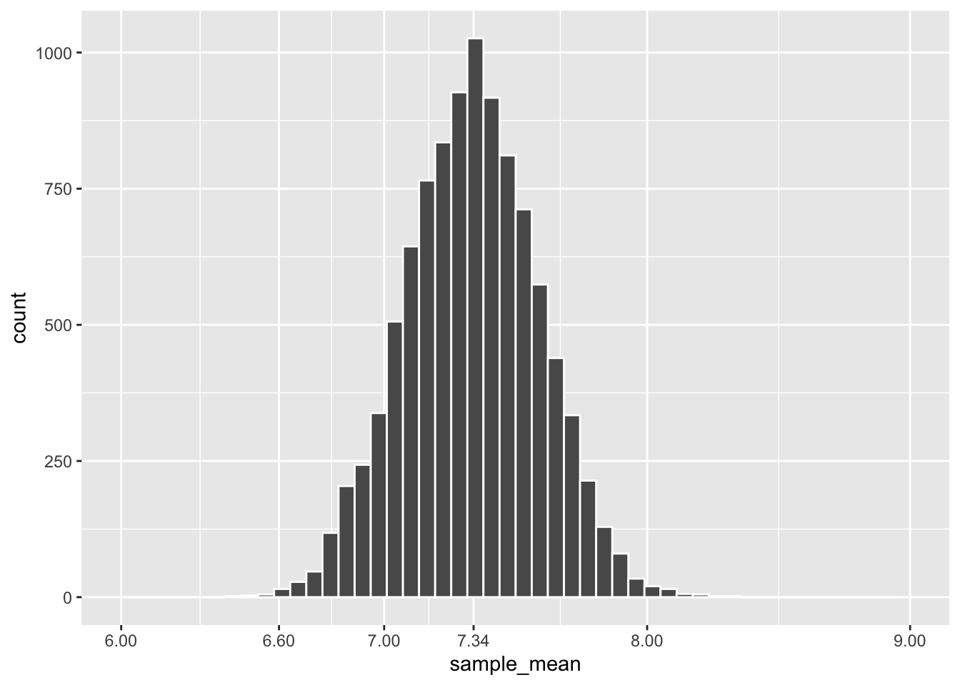
Figure 3.5: Frequency Histogram of Means of 10,000 Dragon Samples
A quick glance at this histogram should pique your curiosity since its shape looks very much like that of a normal distribution. It is very important to put this into perspective. The plot in Figure 3.4 represents 1 sample of wingspan lengths. The leftmost bar in that single-sample plot shows only 1 dragon in the sample had a wingspan less than 4. The tallest bar in that single-sample plot shows that there were 8 dragons in the sample that had a wingspan slightly greater than 5. The heights of the bars count individual dragons and add up to 75, the size of the sample.
In contrast, the heights of the bars in Figure 3.5 represent numbers of samples (not individual dragons). The tallest bar shows that slightly over 1,000 samples (out of the 10,000 total) have a mean of approximately 7.34. The leftmost bars show that very few out of those 10,000 samples had a mean of less than 6.6.
The plot in Figure 3.5 is a frequency histogram, counting how many sample means fall into each bar. Since it represents all of the samples, the sum of the heights of all the bars is 10,000. It is a simple matter to turn this into a relative frequency histogram as shown in Figure 3.6 below. Each bar in a relative frequency histogram gives the proportion of that bar’s count out of the total count. For example, if the tallest bar in Figure 3.5 represents 1050 sample means, then the tallest bar in Figure 3.6 represents a relative frequency of \(1050/10000 = .105\), which means that bar represents 10.5% of the 10,000 sample means. Since the bars include 100% of the sample means, the sum of the heights of all the bars in the relative frequency histogram is 1. That’s a big clue as to where this discussion is going!
The code below generates the relative frequency histogram in Figure 3.6. The “trick” in the code that produces a relative frequency histogram is the addition of the y-axis aesthetic that accesses a count variable that geom_histogram() creates internally. The stat(count) / sum(count) expression changes the y-axis bar heights from counts into relative proportions. ANY frequency histogram can be transformed into a relative frequency histogram in this way.
 # ggplot internally populates count, which stat(count)/sum(count) turns into a proportion.
 ggplot(means_10000_samples, mapping = aes(x = sample_mean, y = stat(count)/sum(count))) +
  geom_histogram(bins=50, color="white") +
  scale_x_continuous(limits = c(6, 9), breaks = c(6,6.6,7,7.2,7.34,7.5,8,9)) +
labs(y = "Probability") 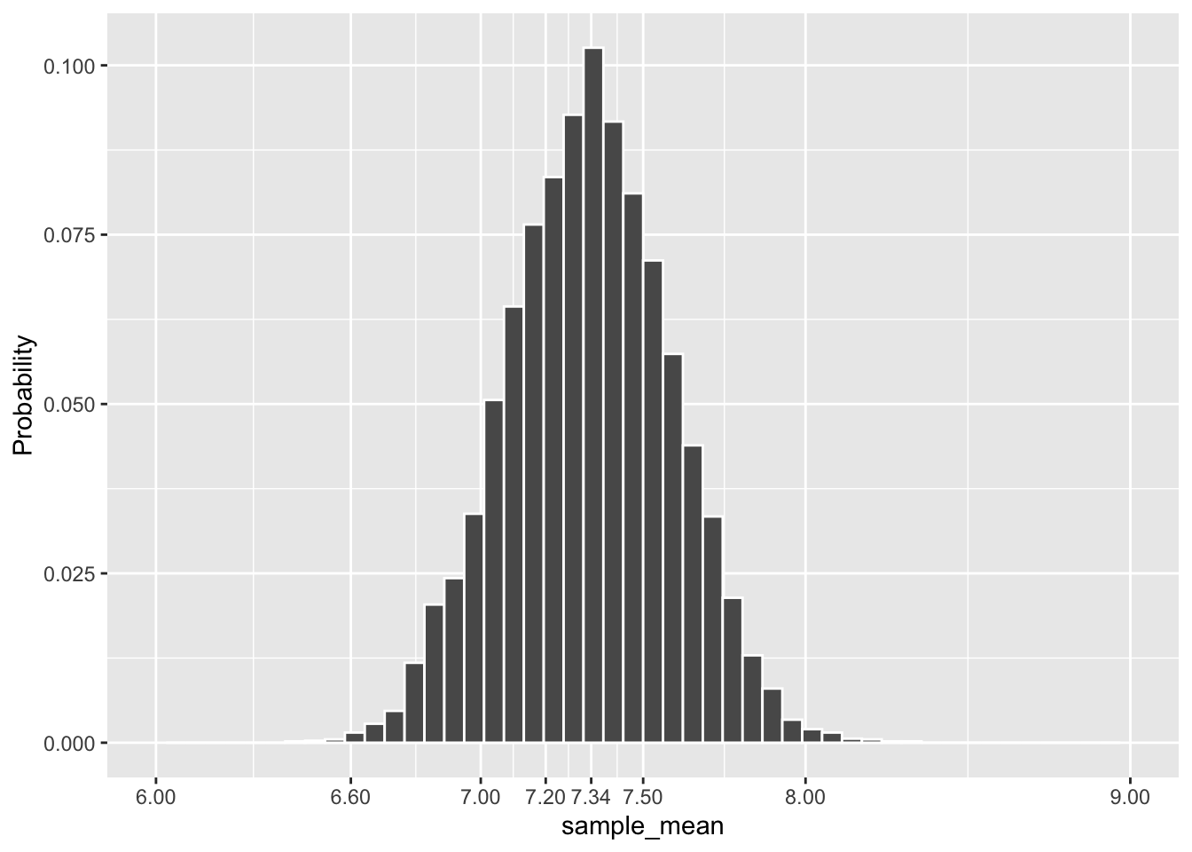
Figure 3.6: Relative Frequency Histogram of Means of 10,000 Dragon Samples
All things being equal (same data and binwidth), a frequency histogram and its relative frequency counterpart ALWAYS have exactly the same mean and standard deviation, hence the same “center” and same shape. We have already mentioned that the heights of all the bars in a relative frequency histogram add up to 1. Therefore, a relative frequency histogram is a type of discrete probability distribution. It’s an empirical Sampling Distribution that shows how the means of the 10,000 simulated samples are distributed.
The simulated sampling distribution meets the goal stated further above: it provides a probability model to quantify the sampling variation for the means of samples of size n=75 taken from the dragon population. For example, the tallest bar indicates that there is just over a .1 probability that a size n=75 sample has a mean of approximately 7.34. Similarly, a sample with mean roughly between 7.2 and 7.5 should occur with probability of about .4 (roughly the sum of the tallest 5 bars).
It’s very important to take a moment to reflect on this terminology. They sound similar, but the Distribution of a Sample and a Sampling Distribution are very different.
Distribution of a Sample
The “distribution of a sample” shows how the values from one sample of size n taken from the population are distributed. The bar heights in the histogram count how many of the n sampled values fall into each region of the x-axis.
Sampling Distribution
A “sampling distribution” shows how the means of different samples (each of the same size) taken from the population are distributed. The bar heights in the histogram count how many means of entire samples fall into each region of the x-axis. It’s a probability model for the space of all possible samples (each of the same size) taken from a population.
Since the empirical sampling distribution shown in Figure 3.6 represents a huge simulation with 10,000 samples, we can be confident that it is a good probability model for all possible samples of size 75 taken from the dragon population. Clearly, 10,000 is not some magic number. Many, many more than 10,000 distinct size 75 samples can be taken from a population of 2510 dragons. The point is that 10,000 is big enough to confidently invoke the law of large numbers, which speaks to asymptotic behavior observed through large numbers of simulations.
Law of Large Numbers
The law of large numbers states roughly that the more times you repeat an experiment, the more closely the observed outcome should be to the actual mathematical probability. For example, flip a coin 100 times, and you might get a .6 proportion of heads which is not very close to the actual mathematical probability of .5. But flip a coin a huge number of times, say 10,000, and the law of large numbers indicates that the observed proportion of heads should be very, very close to .5. A more technical statement of the law of large numbers is that observations from repetitive experiments asymptotically approach the actual probability as the number of repetitions increases.
Recall that the mean of a distribution is also called the expectation. It makes logical sense (and can be proven mathematically) that the expectation (best guess) for the mean of a sample taken from a population is the population mean. It follows that the best guess for the expectation of an empirical sampling distribution should also be the population mean. That’s why the dragon population mean, \(\mu=7.34\) is specifically labeled on the x-axis in the center of the plot in Figure 3.5 (and also 3.6).
We’ll now see how accurate that guess for the mean of the empirical sampling distribution actually was. The code chunk below computes the mean and the standard deviation of the 10,000 different samples means contained in the means_10000_samples table. That’s the same table from which both the frequency and relative frequency histograms above were plotted.
# Empirical Sampling Distribution mean and standard deviation
means_10000_samples %>%
  summarize(
    samp_dist_mean = mean(sample_mean),
    SE = sd(sample_mean)
  )
## # A tibble: 1 × 2
##   samp_dist_mean    SE
##            <dbl> <dbl>
## 1           7.33 0.253
The sampling distribution mean of 7.33 is indeed quite close to the expectation of 7.34. Of course, the empirical sampling distribution was generated by a computer simulation. If we were to increase the number of simulations that generated the sampling distribution, perhaps to 100,000 samples, the law of large numbers indicates the mean of resulting empirical sampling distribution has a higher probability of being closer to the population mean 7.34.
The standard deviation of a Sampling Distribution is called the Standard Error (SE). Notice that the SE notation was used for that quantity in the code just above. Every probability distribution has a standard deviation, but only the standard deviation of a sampling distribution is called the SE. Sampling Distributions have a special place in statistics, so they get some special terminology.
The amount that a particular sample mean deviates from the expectation is called the sampling error. If a sample is extremely “lucky” and has the same mean as the population, the sampling error is zero. A very “unlucky” sample whose mean is far from the expectation has a large sampling error. Since the sampling distribution SE pertains to the whole space of possible samples, the SE is essentially the average sampling error - the best guess for how much a sample mean will deviate from the expectation.
Another concept to explore through simulation is how sample size affects the sampling distribution. Common sense says that the larger a sample is, the more likely it is to be representative of the population. That is, larger samples are less likely to be unlucky. Let’s see if some simulations support the common sense.
Figure 3.7 shows empirical sampling distributions, each resulting from 10,000 samples of different sizes: 25, 75, and 150. The plots for \(n=25\) and \(n=150\) are new simulations. The \(n=75\) plot uses the same 10,000 samples computed above.
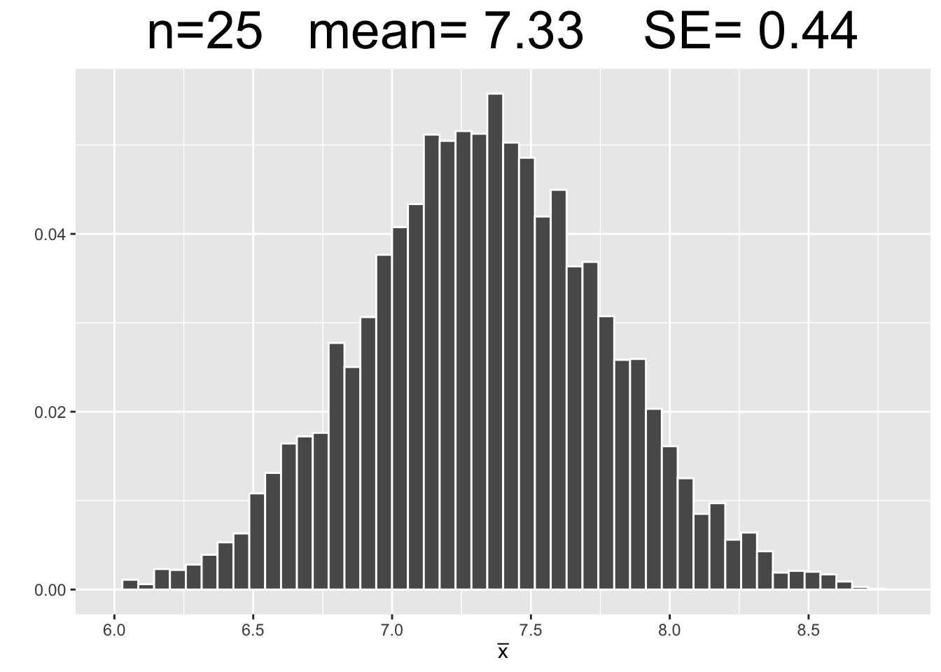
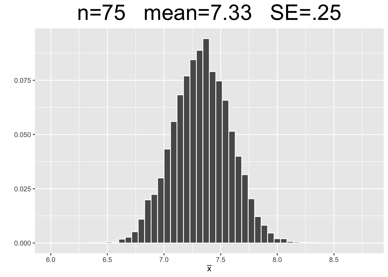
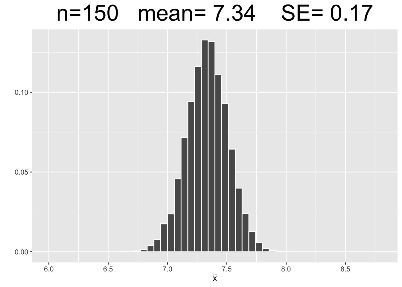
Figure 3.7: Empirical Simulation: Effect of Sample Size on Sampling Distributions
Each plot in Figure 3.7 has the same x-axis scale so that the SE’s (spread of data) can be visually compared being on equal footing, so to speak. The most important observations are listed below.
- Each of the sampling distributions looks roughly normal, even though the original dragon population data was very much non-normal - slightly skewed with with three distinct “humps.”
- As the sample size \(n\) increases, the sampling distributions appear more normal.
- Each sampling distribution has essentially the same mean as the dragon population from which the samples were taken.
- As the sample size \(n\) increases, the SE’s of the sampling distributions decrease, meaning there tends to be less sampling error.
Figure 3.7 shows three computer simulations and therefore does not “prove” anything. However, since each simulation uses such a large number of samples (10,000), the law of large numbers gives confidence that the above list of observations about sampling distributions will hold true as they apply to theoretical sampling distributions. This is basically an empirical “validation” of the mathematical Central Limit Theorem which the next section will explore.
As a side note, computer simulations are extremely valuable in general in terms of modeling real phenomena. Elaborate computer simulations involving many thousands of trials are used to model potential weather patterns, possible outcomes of battles in a war, and various economic scenarios, just to name a few examples. Computer simulations are also an important part of machine learning, a Data Science technique that involves predictive statistics.
3.4 Central Limit Theorem
The simulations in the previous section serve two important purposes: to introduce terms and concepts related to sampling distributions, and to empirically demonstrate the Central Central Limit Theorem. But in a real setting, you don’t have access to the entire population data. So the next best thing is to take a random sample for purposes of inference. Further, you can usually collect only one sample since sampling can be difficult, expensive, time consuming, or even dangerous.
Suppose the goal is to infer about an unknown population mean \(\mu\). Under certain assumptions, the sampling distribution can be calculated mathematically. For example, if the population is normally distributed (bell curve) with known standard deviation \(\sigma\), then the precise sampling distribution can be calculated mathematically. That is, if a population is \(N(\mu,\sigma^2)\), then the sampling distribution can be proven to be \(N(\mu,\frac{\sigma^2}{n})\) where \(n\) is the sample size. The Standard Error is then \(SE =\frac{\sigma}{\sqrt{n}}\) being the square root of the variance.
Observe that the SE decreases as the sample size increases because the denominator of the fraction gets bigger as \(n\) gets bigger. Again, this aligns with common sense since a larger sample tends to be more representative of the entire population, hence less sampling error on average.
Let’s summarize this: If the population is normally distributed, AND you know the population standard deviation \(\sigma\), then the Sampling Distribution for sample means can be mathematically proven to be precisely normal. But what if there are NO assumptions about the distribution of the population. Often you don’t know much, if anything, which is why you sample to infer about the population in the first place!
The Central Limit Theorem applies to ANY population, whether normal or not.
Central Limit Theorem (loosely worded):
When sample means come from larger and larger sample sizes, the sampling distributions of the sample means tend to become more and more normally distributed, and also more and more narrow.
Central Limit Theorem (more precise statement):
As the sample size \(n\) approaches infinity, the sampling distributions of the sample means asymptotically approach a normal distribution with Standard Error \(SE =\frac{\sigma}{\sqrt{n}}\).
IMPORTANT
The CLT does NOT make assumptions about the distribution of the population. The “shape” of the population can be unknown, uniform, skewed, bimodal, or even hard to describe. The CLT still applies! However, generally speaking, the more non-normal the population, the larger the sample size needs to be before the Sampling Distribution is “almost” normal.
The above discussion is summarized below.
| Population Distribution | Sampling Distribution of Means |
|---|---|
| Normal \(N(\mu,\sigma^2)\) | Exactly Normal \(N(\mu,(\frac{\sigma}{\sqrt{n}})^2)\) for ANY sample size \(n\) |
| Any Population with mean \(\mu\) and standard deviation \(\sigma\) | CLT \(\implies\) Approximately Normal \(N(\mu,(\frac{\sigma}{\sqrt{n}})^2)\) Better approximation as sample size \(n\) increases |
Recall that the dragon population parameters were calculated to be \(\mu=7.34\) and \(\sigma=2.23\). The following code calculates the \(n=75\) sampling distribution SE as indicated by the CLT.
Using the above calculation, the CLT indicates that the sampling distribution for all \(n=75\) samples taken from the dragon population is approximately \(N(7.34,(.257)^2)\). Even though the dragon population is not normal, the \(n=75\) sample size is easily large enough to apply the CLT. Most statistics books use \(n=30\) as the smallest sample size to assume through the CLT that the sampling distribution is approximately normal. The sample size \(n=30\) is not some magic number in that respect, and larger samples are always desirable if possible. Nonetheless, \(n=30\) is the most frequently cited bare minimum for “large” samples.
Figure 3.8 shows the \(N(7.34,(.257)^2)\) sampling distribution for \(n=75\) samples calculated just above, and also sampling distributions for \(n=25\) and \(n=150\) sample sizes that result from similar calculations. Figure 3.8 is essentially the math/CLT analog of the three simulation-generated empirical sampling distributions in Figure 3.7. Each plot uses the same x-axis scale so that it’s apparent how the SE’s decrease as \(n\) increases.
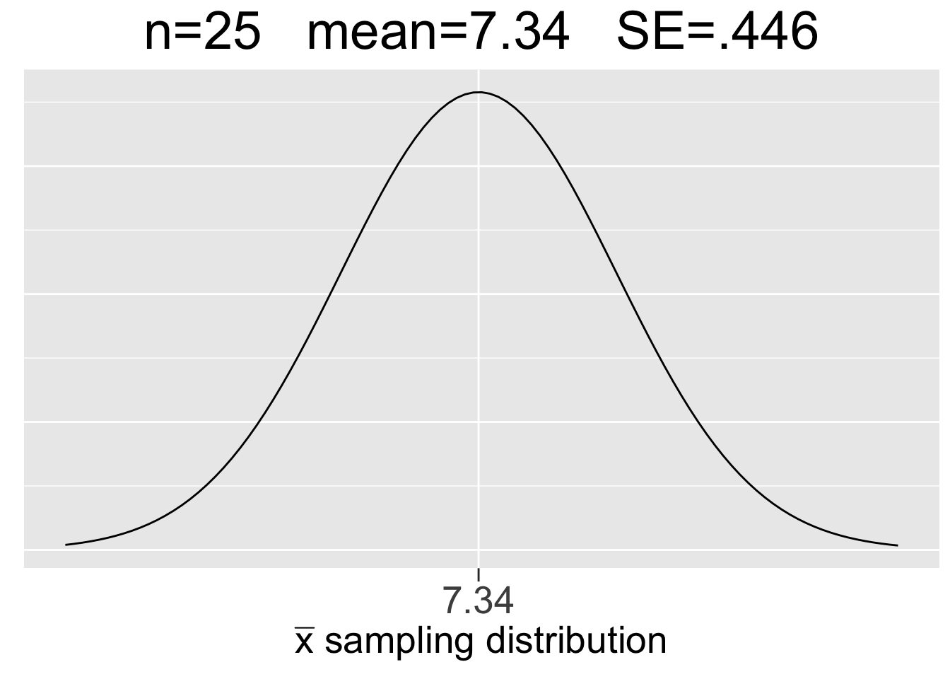
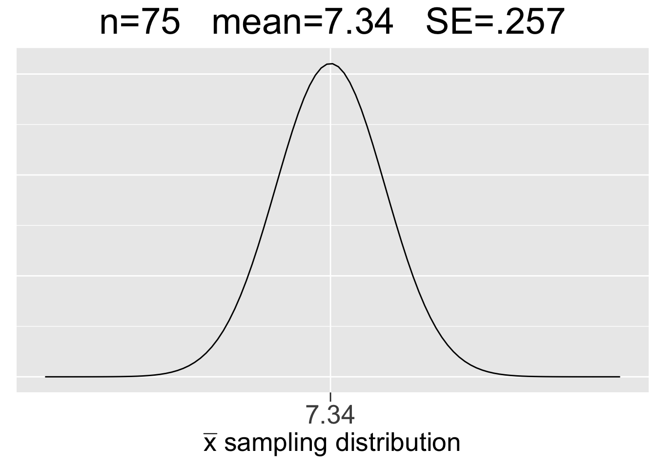
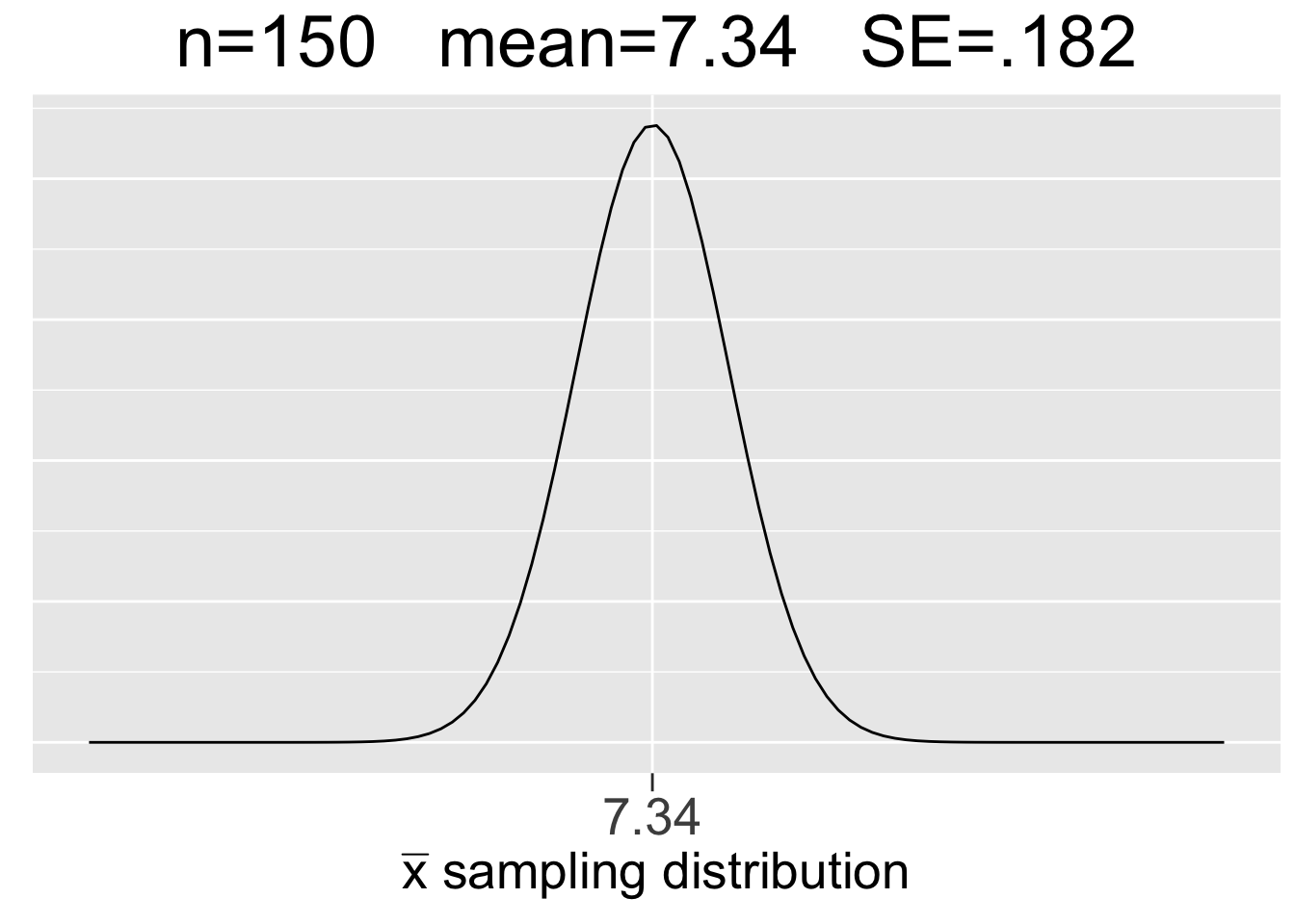
Figure 3.8: Visualization of the Central Limit Theorem
Some important observations about the CLT visualization in Figure 3.8 are listed below:
- Each sample size \(n\) gives a different sampling distribution - a probability model ONLY for the space of all possible samples of that size.
- The mean of each sampling distribution is the population mean \(\mu=7.34\), the expectation (best guess) for a sample mean \(\bar{x}\).
- The sampling distributions get more narrow (smaller SE) as the sample size increases, reflecting the fact that a larger sample tends to incur less sampling error.
Compare results of the simulation shown in Figure 3.7 to the CLT results in Figure 3.8. The numbers are almost the same. That’s not a surprise considering the law of large numbers and the simulations using so many random samples (10,000). It is quite rewarding when mathematical theory backs up empirical results! In fact, that’s often how it works in practice: a conjecture is developed through empirical simulation, then mathematical theory is developed to prove the conjecture. However, the proof of the CLT is best left to an advanced mathematical treatment of the subject.
Now, we’ll explore in more detail the probability model that a sampling distribution provides. Recall that the \(n=75\) sample size is easily large enough that we can assume via the CLT that the sampling distribution in the middle of Figure 3.8 is \(N(7.34,(.257)^2)\).
The dragon sample shown in Figure 3.4 with \(\bar{x}=6.96\) is only one of the many, many possible samples of size \(n=75\) taken from the dragon population. The z-score for that sample mean is easily calculated to be \(z=(6.96-7.34)/.257=-1.5\), meaning the mean of that sample is 1.5 SE’s below the expectation of 7.34. Recalling the 68-95-99.7 rule for normal distributions, that indicates that the sample is fairly typical among all possible samples. Indeed, about 68% of all \(n=75\) samples should be within 1 SE of the mean, and about 90% with 2 SE’s.
Inferential statistics is sort of like a probability game. When sampling from a population, you might get a very “unlucky” sample that doesn’t represent the population well, just like you might get unlucky and get only 1 head out of 10 coin flips. Just for the sake of discussion, let’s say that a \(n=75\) dragon sample is unlucky if its mean is more than 3 SE’s from the sampling distribution expectation. The 68-95-99.7 rule says that’s about .3% (3 out every 1000) of all possible samples. Solving the equation \(3=(\bar{x}-7.34)/.257\) gives \(\bar{x}=8.11\). Solving a similar equation when \(z=-3\) gives \(\bar{x}=6.57\). Thus, a dragon sample with mean outside the interval \([6.57,8.11]\) would be what we are calling unlucky. It works well for this discussion, but it’s important to note that “lucky” is not an official term in statistics!
Similarly, the probability model given by a sampling distribution can be used to answer questions like: What’s the probability in taking an \(n=75\) random sample from the dragon population that it’s mean is closer to the expectation of \(7.34\) than the \(\bar{x}=6.96\) sample from Figure 3.4? Said another way, what’s the probability that another \(n=75\) random sample from the same population is more lucky?
The quantity \(P(6.96\le\bar{x}\le7.34)\)is only half that probability since we also need to consider samples with means slightly larger than \(7.34\). It follows that the probability we are after is the central area under the sampling distribution curve between \(6.96\) and \(7.72\), which is symbolically \(P(6.96\le\bar{x}\le7.72)\). Recalling from Section ?? that pnorm computes left tail areas, two ways to calculate that probability are shown below.
# tail area to the left of 7.72 - tail area to the left of 6.96
pnorm(7.72, mean=7.34, sd=.257) -  pnorm(6.96, mean=7.34, sd=.257)
## [1] 0.861
# 1 - twice the tail area to the left of 6.96
1 - 2 * pnorm(6.96, mean=7.34, sd=.257)
## [1] 0.861
So there’s an 86% chance that any random \(n=75\) sample represents the population as well as the one from Figure 3.4. If you don’t understand why the two calculations above result in the same value, drawing the distribution on scratch paper and adding some shading should help.
We conclude this section with some additional perspective on sampling distributions that you might find interesting. Recall that the set of all possible outcomes of an experiment is called the sample space. If the experiment is taking a random sample of size \(n\) from a population, then the set of all possible samples can be considered a sample space. To be more specific in this context, we’ll instead use the term sampling space. It’s instructive to consider how large such sampling spaces are.
A branch of mathematics called combinatorics (think permutations and combinations) can be used to calculate the size of such sampling spaces. Suppose the experiment is to take a random sample of size \(n=25\) from a population of size 100. Then the size of the sampling space (number of possible, distinct samples of size 25) is given mathematically by \(C(100,25) = 2.43e23\) which is scientific notation for about 243,000,000,000,000,000,000,000. (That number could be bigger than the number stars in the universe.) \(C(100,25)\) is called a “combination 100 choose 25” and is easily computed using R.
In the dragon sampling example above where 75 dragons were sampled from a total of 2,510, the size of the sampling space is \(C(2510,75) = 1.25e145\) which is a 1 followed by more than 145 zeros, which is bigger than a Googol (\(1e100\)) which at one point was the largest number that actually had a name. (And from which a popular search engine derived it’s name!)
The number of possible point estimates, such as a mean, computed from a sampling space might be substantially smaller. For example, {1,3} and {0,4} are distinct size 2 samples, but both have the same mean. Nonetheless, we are still talking about astronomically large numbers of possible sample means.
The main point here is not those huge specific numbers, but that they so large as to be practically infinite. (A mathematician should really never say that!) So even though a sampling space taken from a finite population is also finite, it’s so large that it makes sense that the sampling distribution is modeled by a continuous normal distribution whose domain is the entire real number line.
3.5 CLT For Proportions
Binomial distributions are approximately normal under certain conditions. That might seem strange since a binomial distribution is discrete, whereas a normal distribution is continuous. It doesn’t mean it’s literally normal-ish in the sense of continuous curve. Rather, it means the binomial distribution has essentially the same shape as a normal curve.
Figure 3.9 shows two \(bin(n,p)\) distributions, each with a corresponding \(N(np,\left(\sqrt{np(1-p)}\right)^2)\) distribution super-imposed on top. Each binomial and its corresponding normal distribution have exactly the same \(\mu=np\) and standard deviation \(\sigma=\sqrt{np(1-p)}\). The left one is \(bin(10,1/6)\) (10 die rolls) and the right one is \(bin(60,1/6)\) (60 die rolls). The normal curve in the right one is obviously a much better fit, whereas the skew is more evident in the left one, and therefore the normal approximation is not as good.
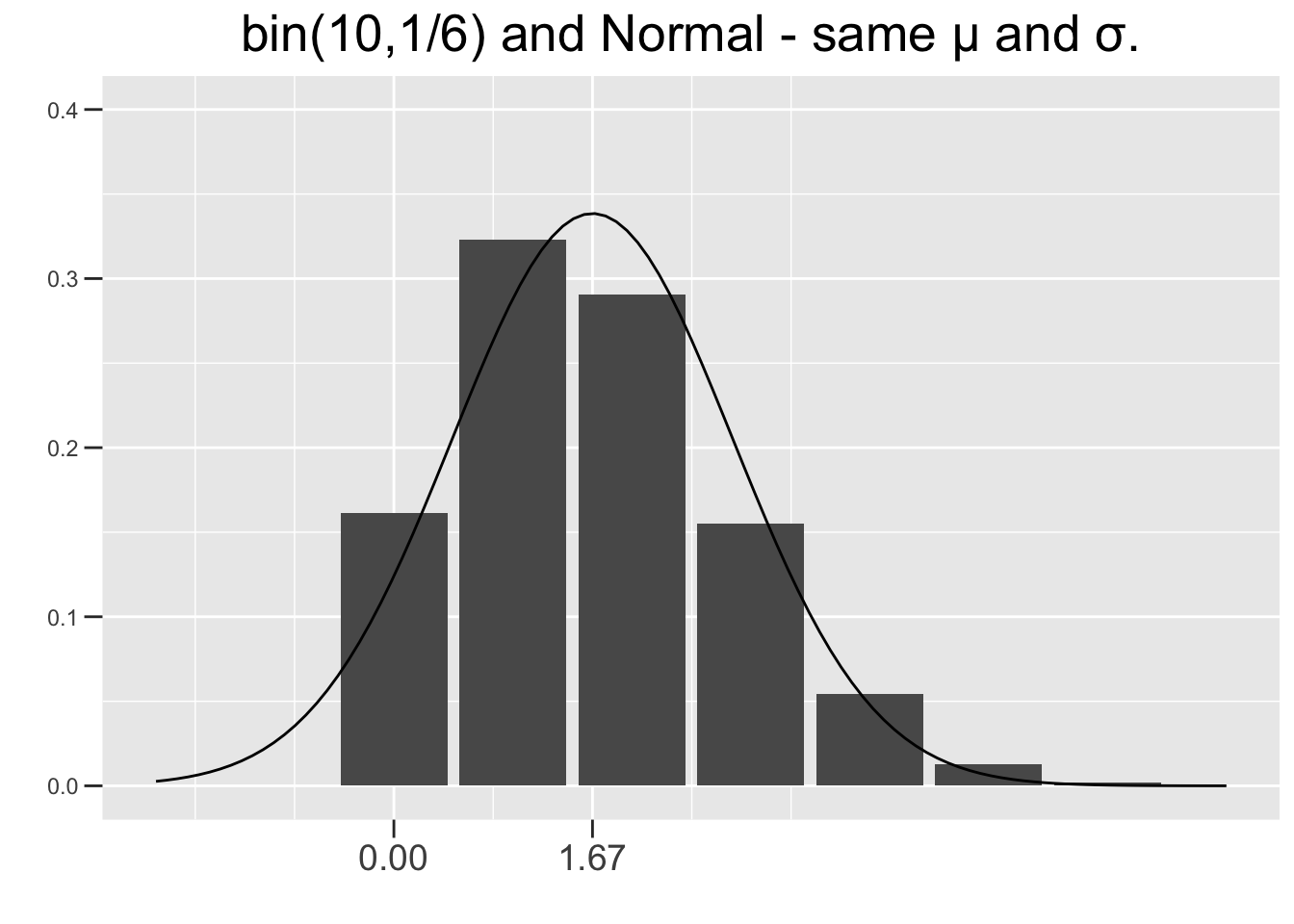
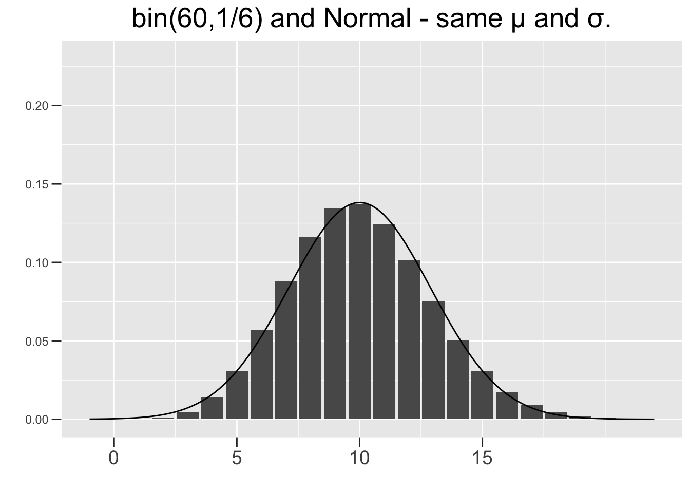
Figure 3.9: Normal Approximations to Binomial Distributions
Any \(bin(n,.5)\) distribution, like the one in Figure 2.2, is symmetric and normal-shaped. But the further \(p\) is away from .5 toward 0 or 1, the more skewed a binomial distributions is. However, making \(n\) larger tends to reduce the skew and give a better normal approximation as shown in Figure 3.9. So there are two ways for a binomial distribution to be approximately normal shaped: either \(p\) needs to be close to .5 or \(n\) needs to be large enough to compensate if \(p\) is closer to 0 or 1. The conditions on \(n\) and \(p\) given below satisfy both of those conditions.
Condition for Normal Approximation of a Binomial Distribution
Both of the following should hold for a binomial distribution to be assumed to be approximately normal: \(np\ge 10\) and \(n(1-p) \ge 10\). These conditions ensure that the closer p is to 0 or 1, the larger \(n\) needs to be to compensate. The value of 10 is often cited in introductory statistics books, but some books use 15 or even 5. Sometimes it can depend on the particular statistical application as to how good an approximation is needed. Approximation, after all, is not an exact science!
The plot on the right of Figure 3.9 results in \(np=60\times1/6=10\) and \(n(1-p)=60\times5/6=50\). So both of the above conditions hold, and the normal distribution can be considered a reasonable approximation to the binomial one. Neither condition holds for the plot on the left, confirming the visual evidence that the normal curve is not a good fit.
Historically, such approximations were used to calculate binomial probabilities. Probabilities for normal distributions were more readily obtained, whereas binomial calculations were computationally difficult. However as you saw above, modern computing power has made binomial calculations quick and relatively easy, easier in fact than estimating them accurately with normal approximations which can be a bit tricky.
For example, in the \(bin(60,1/6)\) shown on the right side of Figure 3.9, the binomial probability \(P(x\le5)\) would be estimated by a normal probability of something like \(P(x\le4.5)\) to get enough area under the curve to match all the bars up through 5. That’s called a continuity correction in approximating a discrete distribution with a continuous one. For another example, \(P(x\lt2) \;\;\lt\;\; P(x\le2)\) is true for a binomial since the one with \(\le\) includes an extra bar. But \(P(x\lt2) \;=\; P(x\le2)\) for a normal distribution since continuous distributions have no area under the curve for a single x value. Normal approximations are not as important today for the purpose of finding binomial probabilities, but are still very important in mathematical theory such as the CRT for proportions.
The number of Bernoulli trial successes can be re-framed as a proportion. For example, if a coin is flipped 10 times and 4 are heads, the result can be reported as the proportion \(4/10=.4\) of heads in the experiment instead of the raw number of successes 4. In a political poll, if 550 out of 1000 respondents favor the Republican candidate, then the proportion is \(550/1000=.55\). In polling, it’s much more intuitive to report the proportion than the raw number of successes. Similarly, in a medical study it’s more intuitive to report that a certain medicine was effective on 25% (.25 proportion) of the patients, rather than on some raw number out of the total.
In general, a binomial experiment with \(n\) Bernoulli trials can be re-framed as a proportion as follows. If the Bernoulli trials are denoted \(x_1,x_2,...,x_n\), where each \(x_i\) is either 0 (failure) or 1 (success), then the proportion of successes out of the \(n\) trials is \(\hat{p} = (x_1+x_2+\cdots+x_n)/n\). For example, if 10 coin flips result in 4 heads, then the resulting proportion of successes is \(\hat{p} = 4/10\) since there would be 4 1’s in the numerator, the rest being 0’s. Note that \(\hat{p}\) is effectively the observed average of a random sample of \(n\) Bernoulli trials.
This essentially re-frames a binomial experiment as a random sample of size \(n\), where \(\hat{p}\) is the mean of the sample. The CLT for proportions is derived mathematically by using the normal approximation of a binomial distribution, treating a binomial proportion as a sample mean, and applying the CLT for means. That’s an over-simplification, but suffices as an overview of how the two CLT theorems relate.
Central Limit Theorem for Proportions:
As \(n\) approaches infinity, the sampling distributions of proportions asymptotically approach a normal distribution with mean \(p\) and Standard Error \(SE =\sqrt{\frac{p(1-p)}{n}}\).
The summary below combines both the criteria for a normal approximation to a binomial distribution, and the asymptotic behavior of the sampling distribution predicted by the CLT for proportions.
| Population Distribution | Sampling Distribution of Proportions |
|---|---|
| \(bin(n,p)\) | CLT \(\implies\) Approximately Normal \(N(p,\left(\sqrt{\frac{p(1-p)}{n}}\right)^2)\) Better approximation as number of trials \(n\) increases. At a minimum, both of the following should hold: \(np\ge 10\) and \(n(1-p) \ge 10\) |
To provide insight into the CLT for proportions, we return to the \(bin(60,1/6)\) example shown on the right side of Figure 3.9. It was already noted above that it satisfies both of the normal approximation conditions, but just barely since \(np=10\). Therefore, the CLT for proportions is applicable and the sampling distribution is approximately \(N(.167,(.048)^2)\), where \(SE=\sqrt{p(1-p)/n}=.048\) is computed below.
Figure 3.10 shows sampling distributions for binomial experiments of 3 different sizes: \(bin(60,1/6)\), \(bin(300,1/6)\), and \(bin(1000,1/6)\). In each case, \(p=1/6\) but \(n\) increases to reflect 60, 300, and 1000 die roll experiments. Each plot uses the same x-axis scale so that it’s apparent how the SE’s decrease as \(n\) increases.
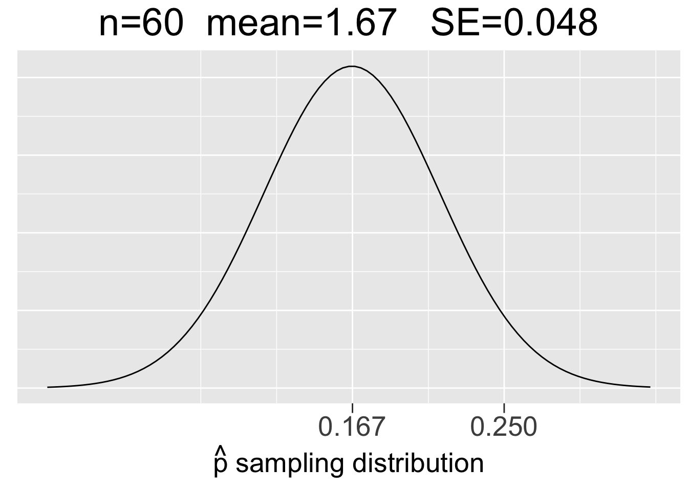
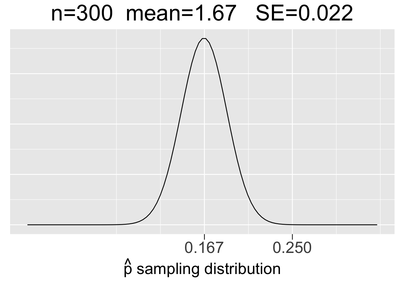
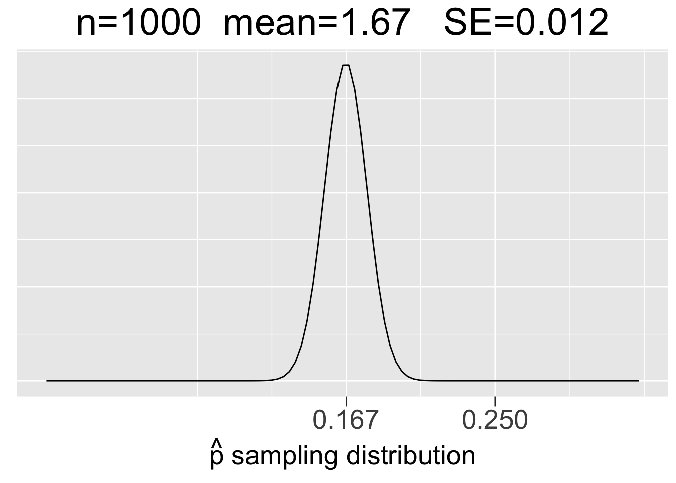
Figure 3.10: Visualization of the CLT for Proportions
The main take-aways from Figure 3.9 about sampling distributions for proportions are very similar to the ones listed in the previous section for means, just with a somewhat different context.
- Each sample size \(n\) (number of trials) gives a different sampling distribution.
- The mean of each sampling distribution is the actual proportion \(p\), the expectation (best guess) for a proportion \(\hat{p}\) observed through experimentation.
- The sampling distributions get more narrow (smaller SE) as the number of trials \(n\) increases, reflecting the fact that a larger number of trials tends to give a more predictable result (less sampling error).
To emphasize what a sampling distribution for proportions actually is, we return to the \(bin(60,1/6)\) experiment of rolling a die 60 times and recording the number of 1’s. The distribution of the \(bin(60,1/6)\) experiment was shown on the right of Figure 3.9. That’s the binomial distribution of a single experiment, where \(x\) represents the number of 1’s out of 60 rolls.
However, the \(N(.167,(.048)^2)\) sampling distribution on the left side of Figure 3.10 is a probability model for the space of all possible \(bin(60,1/6)\) experiments. It gives probabilities for how observed \(\hat{p}\) values from different \(bin(60,1/6)\) experiments compare to the expectation \(p\). So let’s do an experiment and compare it to the expectation!
Instead of considering an abstract \(bin(60,1/6)\) experiment, suppose you are playing a game with dice in which rolls of 1 are desirable. Suppose you have a lucky game and roll 15 1’s in 60 rolls. That’s an observed proportion \(\hat{p}=15/60=.25\) which is marked on the x-axis in in the left-most plot in Figure 3.10 so that you can see where your lucky 60-roll dice games fits in the space of all possible 60-roll game outcomes. It’s quite a bit larger than the expectation of \(p=1/6=.167\), but doesn’t appear to be a highly unusual outcome as it’s not too far out in the tail of the sampling distribution.
That distribution has standard deviation \(SE=.048\), so the z score for the observed \(\hat{p}=.25\) is \(z=(.25-.167)/.048 = 1.73\). Your lucky game with 15 1’s is just under 2 standard deviations above the expectation. Recalling the 68-95-99.7 rule, about 95% of the outcomes from 60-roll dice games should be within 2 standard deviations of the expectation. With a z-score of 1.73, your lucky \(\hat{p}=.25\) outcome is not even in the 5% most extreme 60-roll game outcomes. Your game was somewhat lucky, but not bigtime lucky (of course, bigtime being a highly precise mathematical term).
It’s worth noting that 15 1’s in the 60-roll game is actually unlucky in terms of sampling theory where we have used that term to describe an observed sample that does not represent the expectation very well. In a game of chance, you can actually get “game lucky” by being “sampling theory unlucky.” We’re not sure it would be wise to try to explain that nuance to everyone on game night!
For contrast, we’ll now consider the other two plots in Figure 3.10 that would provide probability models for 300-roll and 1000-roll dice games, respectively. Suppose you have similarly lucky games in terms of proportions of \(\hat{p}=75/300=.25\) in a 300-roll game in a 300-roll game and \(\hat{p}=250/1000=.25\) in a 1000-roll game. Common sense (and the law of large numbers) says that even though the observed proportions are the same, the both those games are much luckier since a larger number of trials tends to result in outcomes closer to the expected proportion of \(p=.167\). That is, you are more likely to significantly defy the expectation with fewer trials.
Indeed, you can see in in Figure 3.10 just how far out in the tails of the sampling distributions the \(\hat{p}=.25\) proportions are. We can quantify that by calculating the z-scores using the SE’s of the sampling distributions: \(z=(.25-.167)/.022 = 3.77\) for the 300-roll game and \(z=(.25-.167)/.012 = 6.92\) for the 1000-roll game.
In many situations, z-scores bigger than 3 are considered to be outliers. Going back to the 68-95-99.7 rule again, the z-score of 3.77 easily puts 300-roll lucky game into the .3% (3 out of 1000) of most unlikely outcomes. The z-score of almost 7 for the 1000-roll lucky game is almost off the charts, literally. The \(\hat{p}=.25\) value in the plot on the right side of Figure 3.10 is so far out in the tail that the probability densities are close to 0.
This section concludes with some important subtleties about binomial experiments and sampling theory, the terminology of which will be quite relevant in subsequent chapters. Bernoulli trials (flipping a coin, rolling a die, etc.) must be Independent for a sequence of them to be mathematically modeled using a binomial distribution. That is, if the Bernoulli Trials are such that the probability of success in one trial affects the probability of success in any other trials in any way, then the binomial mathematics don’t apply.
Suppose you have a box of 100 balls, half of which are red and half of which are blue. Then randomly drawing one ball is a Bernoulli trial with the probability of drawing a red ball (success) being .5. In fact, if done perfectly randomly, this experiment is probabilistically equivalent to flipping a fair coin. Now suppose you want to draw 10 balls for a \(bin(10,.5)\) experiment. For the trials to be independent, the balls would have to be drawn with replacement - select one ball, replace it, mix the balls up, then select another ball, replace it, select another ball, and so forth.
In contrast, if the trials are done without replacement then the trials are not independent. For example, suppose you draw a red ball on the first trial and don’t replace it before the second draw. Then the probability of drawing a red ball on the second draw is only 49/100 instead of .5. By not replacing a draw, the ratio of balls in the box changes, thereby changing the probability of the next draw. Therefore, to achieve independent Bernoulli trials, the sampling (trials) have to be done with replacement. The notion of sampling with or without replacement is a very important topic in statistical sampling theory. Much more will be said about this in subsequent chapters.
3.6 Resources
The R scripts provided below contain code from the main examples featured in this chapter. The scripts are numbered to keep them organized in roughly the same order that the examples were presented. The script numbers do not correspond to section numbers within this chapter.
Download a Zip archive containing all the scripts listed below:
Click on Script for Source Code: